01 / Default
Competition
Match results, fixtures, rosters, training and recruitment. Night, Volt and Chalk. Bold type, unambiguous information.
Brand toolkit · Working standard v1.0
One club, two graphic modes. The rules and working artwork behind Bangkok Lacrosse Club's matchday, community and club graphics.
Version 1.0 · 24 September 2026 · 16 pages
01 · Brand architecture
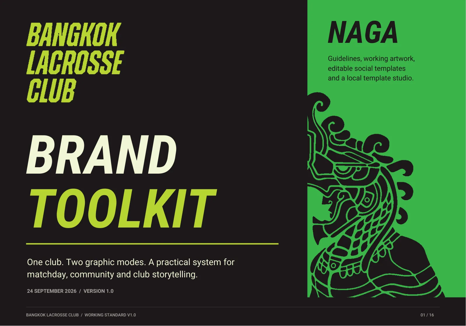
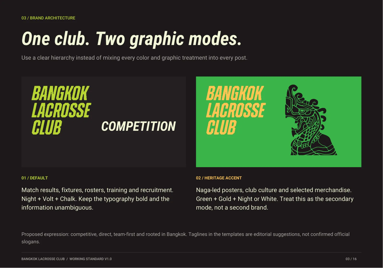
01 / Default
Match results, fixtures, rosters, training and recruitment. Night, Volt and Chalk. Bold type, unambiguous information.
02 / Heritage accent
Naga-led posters, club culture and selected merchandise. Green, Gold and Night or White. A secondary mode, not a second brand.
02 · Wordmark system
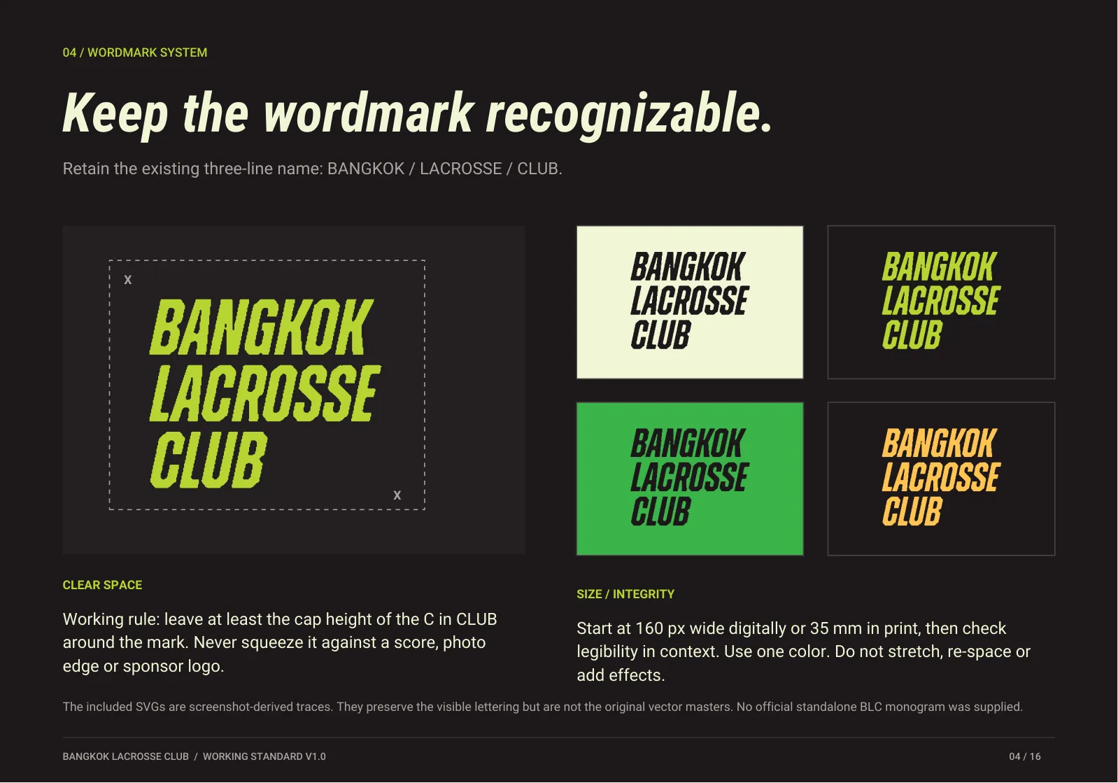
The wordmark files are screenshot-derived traces. They keep the visible lettering but are not original vector masters. No standalone BLC monogram has been supplied.
03 · Illustration system
04 · Colour system
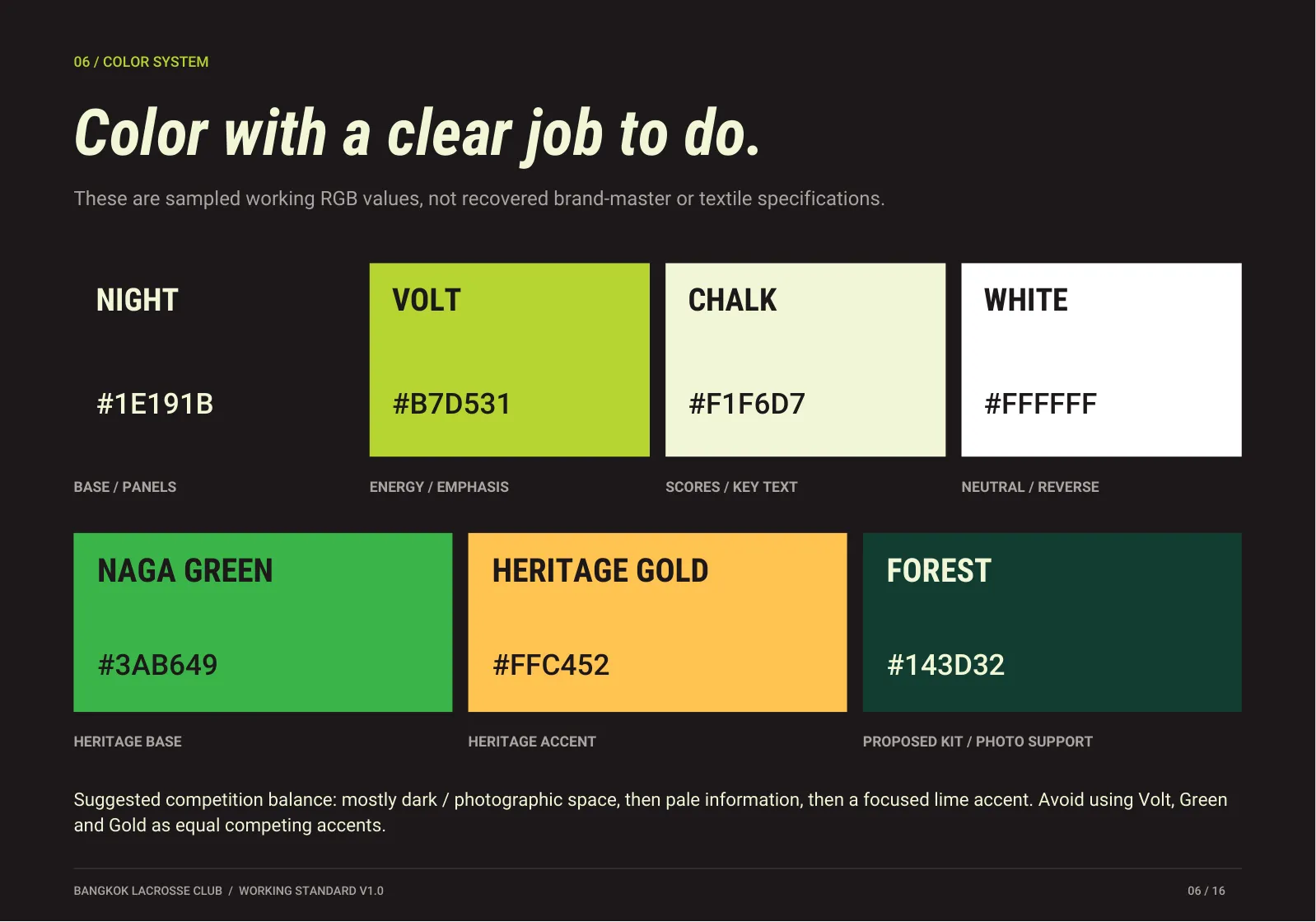
Suggested competition balance: mostly dark or photographic space, then pale information, then a focused lime accent. Don't use Volt, Green and Gold as equal, competing accents. These are sampled working RGB values, not print or textile specifications.
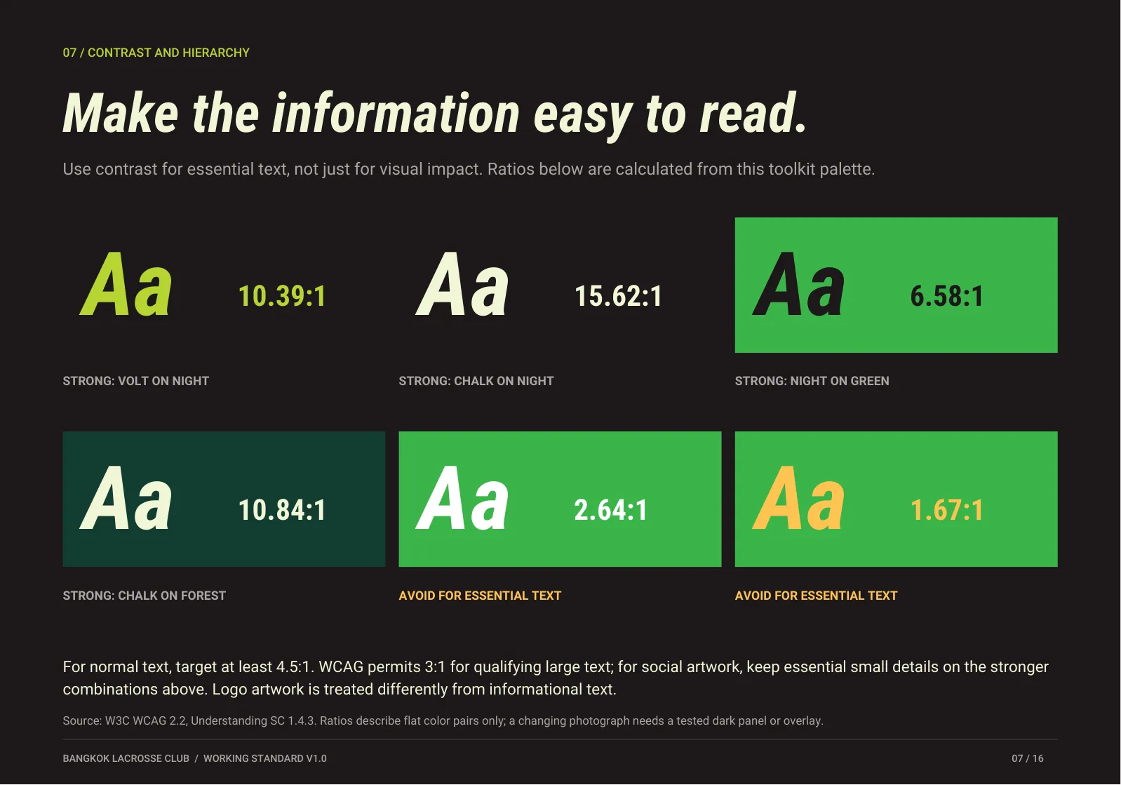
Target at least 4.5:1 for normal text (WCAG 2.2, SC 1.4.3). Ratios describe flat colour pairs; over photographs, use a tested dark panel or overlay.
05 · Typography
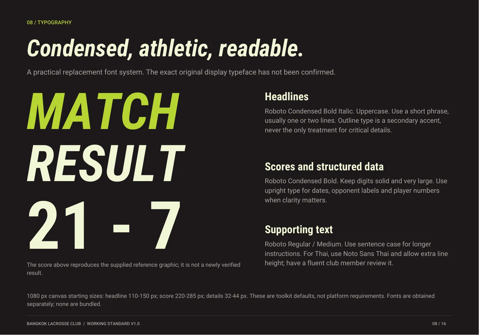
A practical replacement system: the club's original display typeface has not been confirmed. 1080 px canvas starting sizes: headline 110–150 px, score 220–285 px, details 32–44 px.
06 · Photography and layout
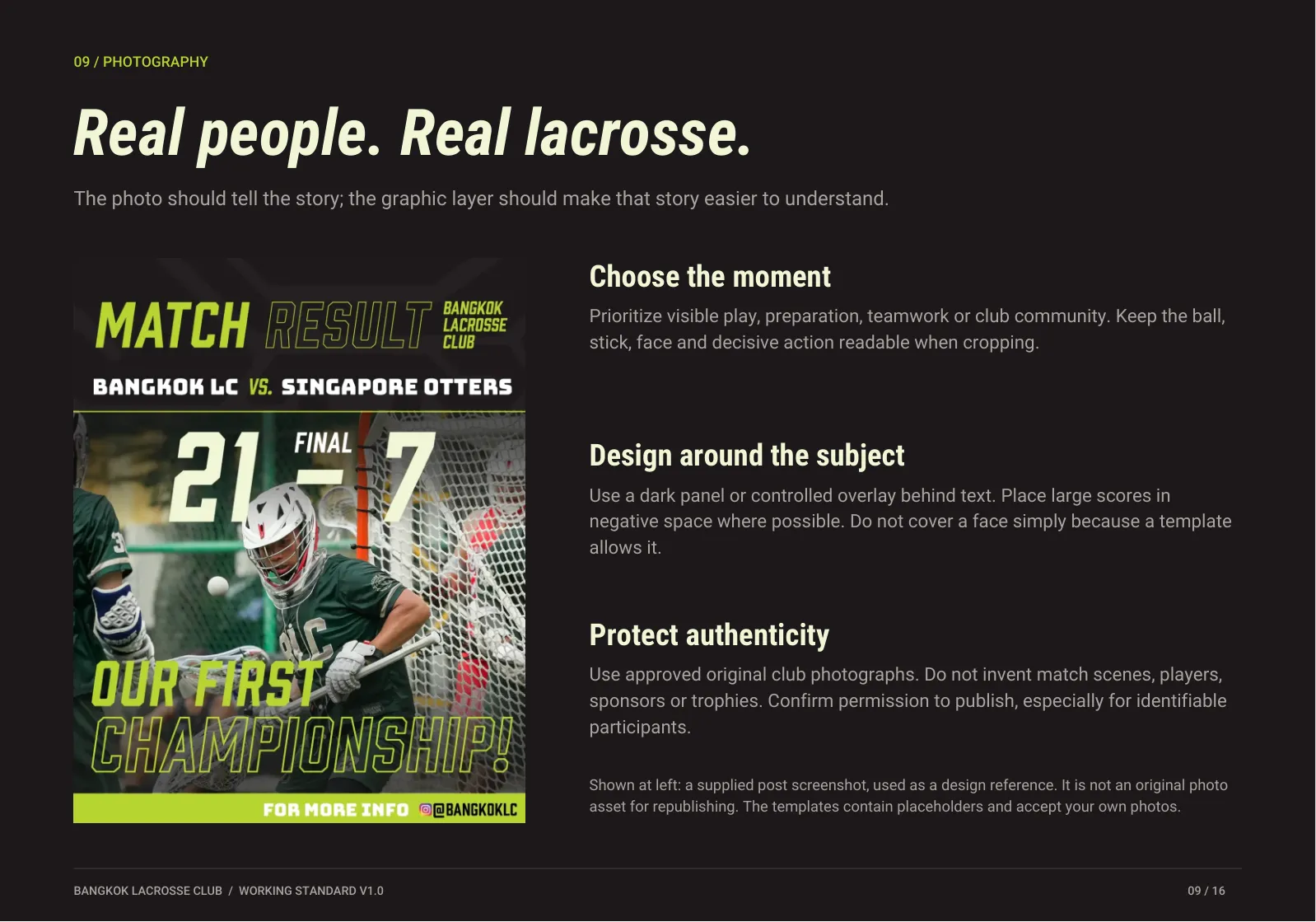
Prioritise visible play, preparation, teamwork or club community. Keep the ball, stick, face and decisive action readable when cropping.
Use a dark panel or controlled overlay behind text. Put big scores in negative space. Don't cover a face just because a template allows it.
Use approved original club photos. Never invent match scenes, players, sponsors or trophies. Confirm permission for identifiable people.
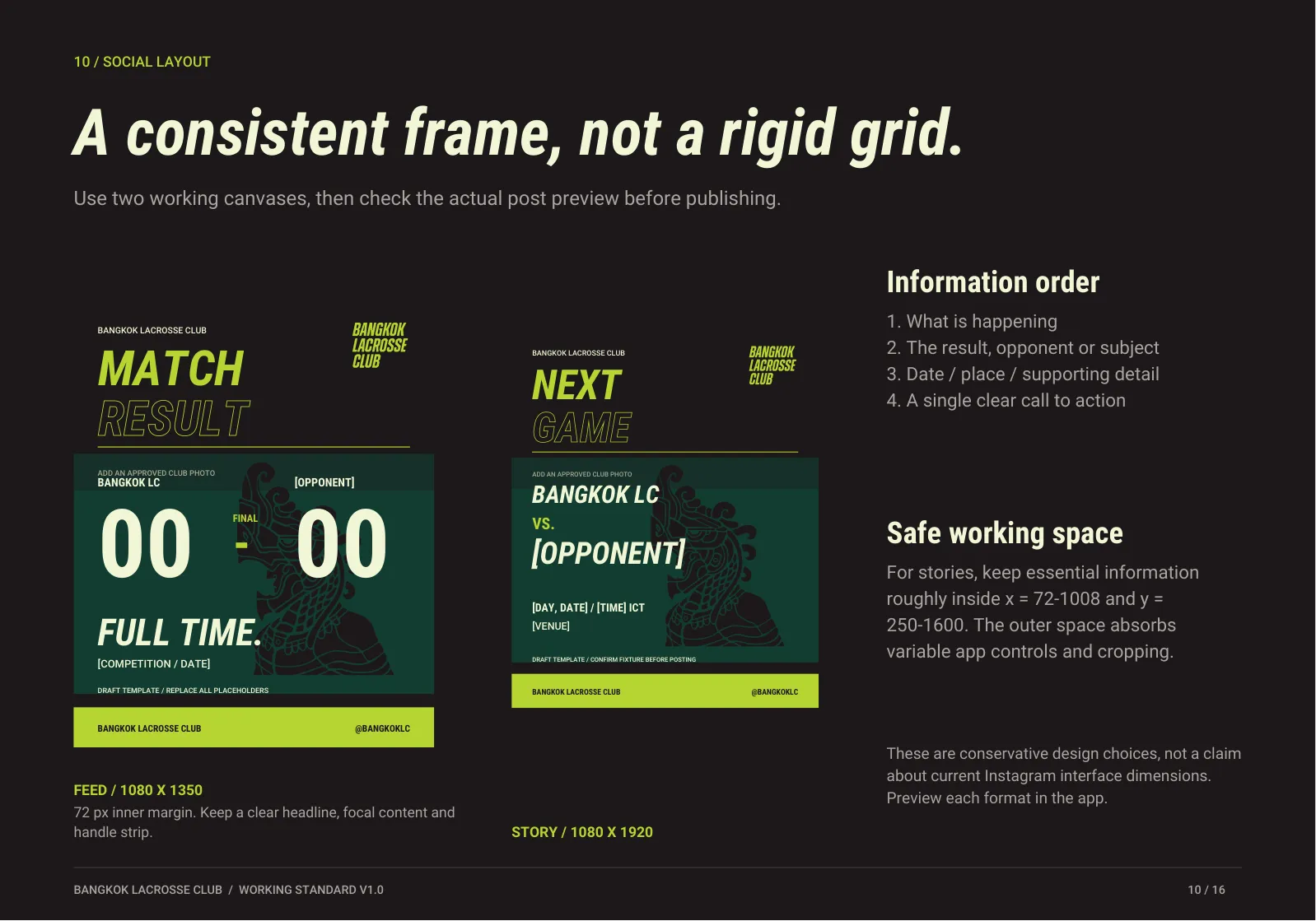
Feed. 72 px inner margin; a clear headline, focal content and handle strip.
Story. Keep essential information roughly inside x 72–1008, y 250–1600.
Information order: what's happening; result, opponent or subject; date, place, detail; one call to action.
07 · Voice and copy
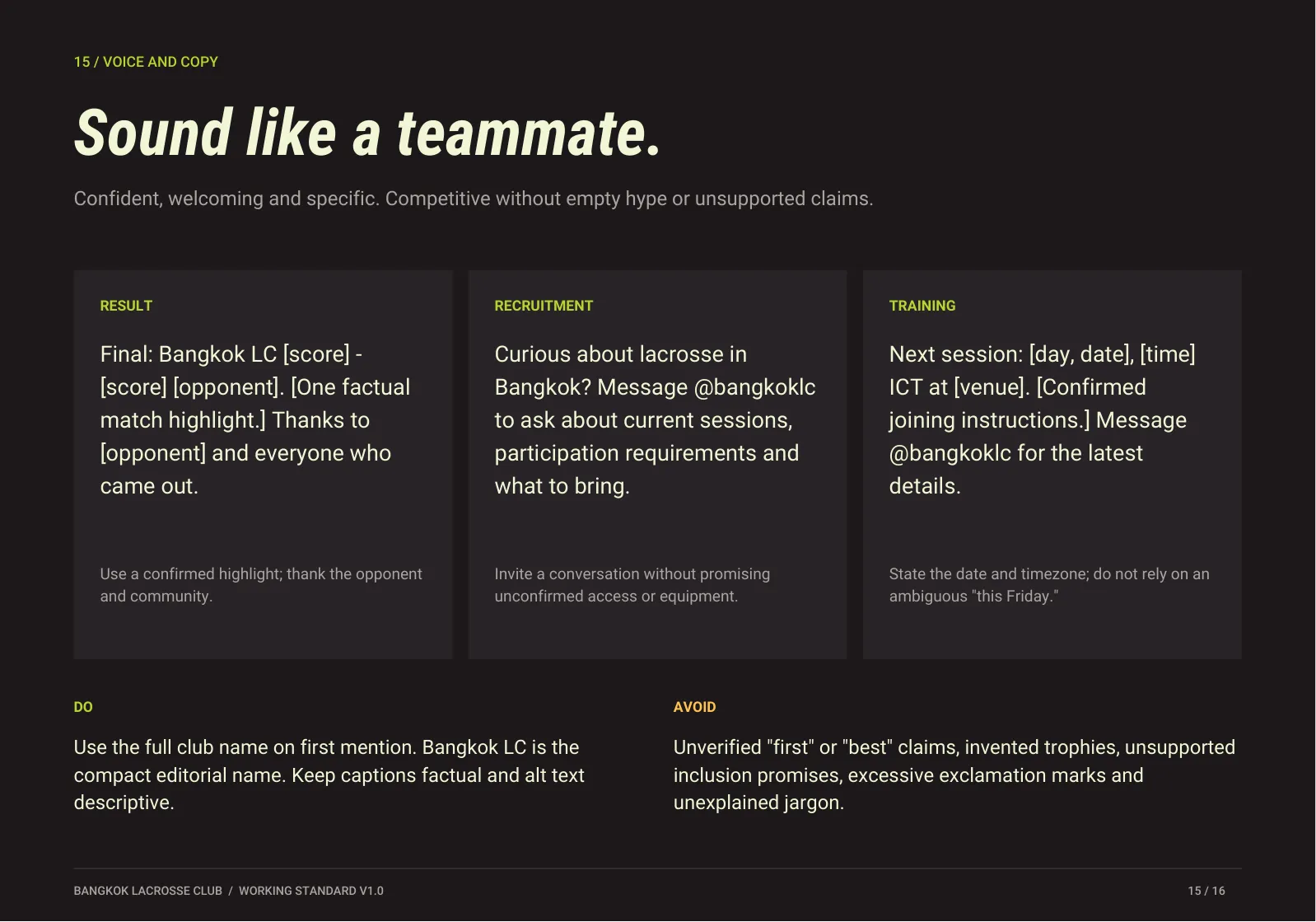
Confident, welcoming and specific. Competitive without empty hype or unsupported claims.
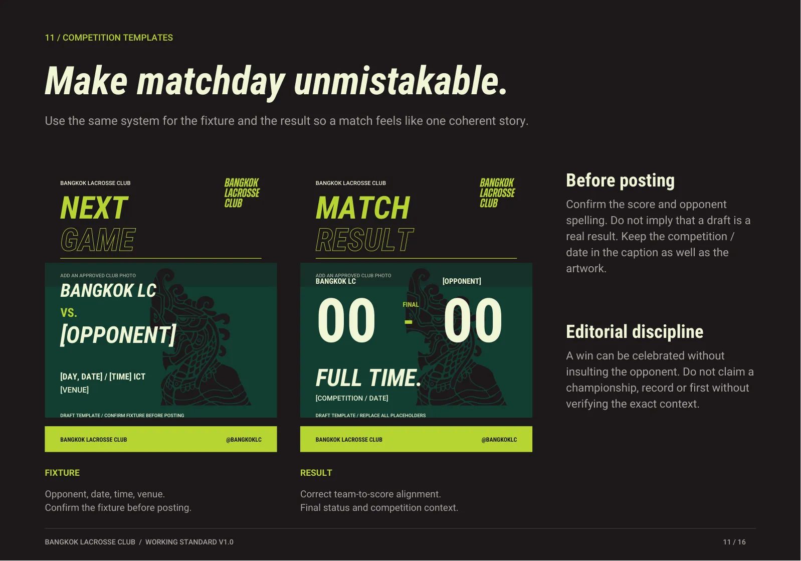
Final: Bangkok LC [score] – [score] [opponent]. [One factual match highlight.] Thanks to [opponent] and everyone who came out.
Curious about lacrosse in Bangkok? Message @bangkoklc to ask about current sessions, participation requirements and what to bring.
Next session: [day, date], [time] ICT at [venue]. [Confirmed joining instructions.] Message @bangkoklc for the latest details.
Use the full club name on first mention; Bangkok LC is the compact editorial name. Keep captions factual and alt text descriptive. State the date and timezone.
Unverified "first" or "best" claims, invented trophies, unsupported inclusion promises, excessive exclamation marks and unexplained jargon. Never write "this Friday" in lasting content.
The full document
01 Cover 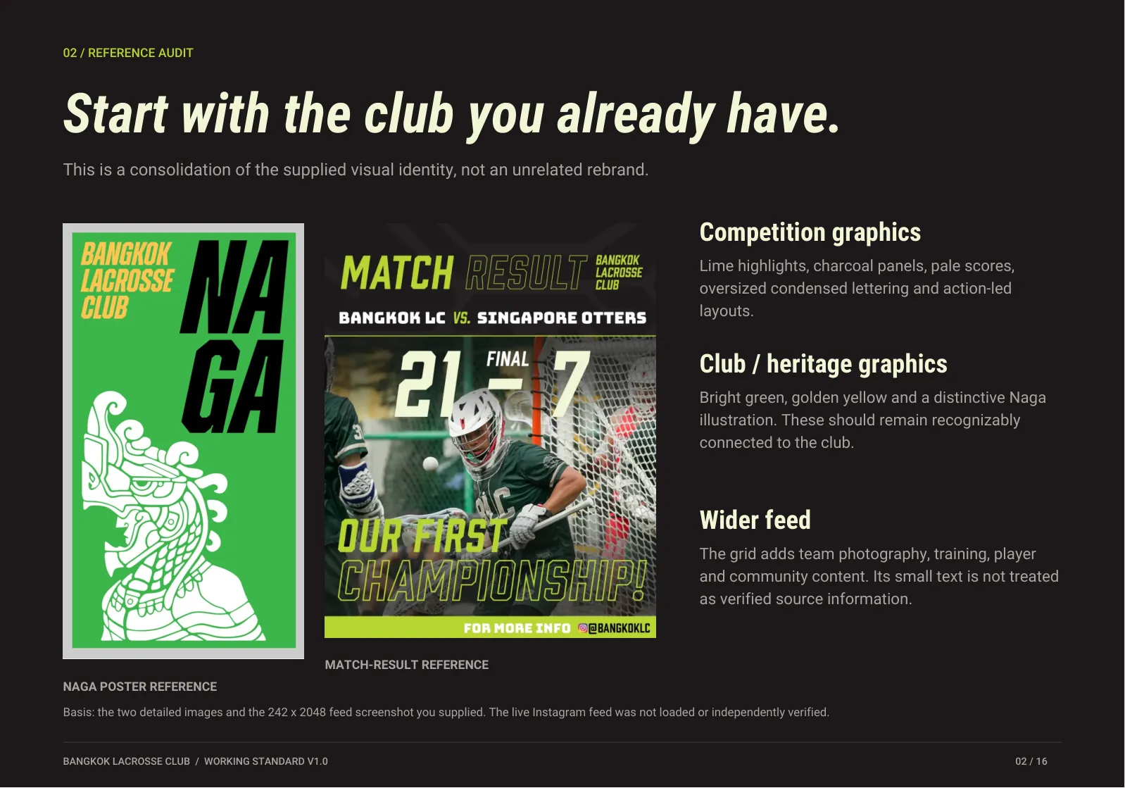 02 Reference audit
  03 Brand architecture
  04 Wordmark system
  05 Illustration system
  06 Color system
  07 Contrast and hierarchy
  08 Typography
  09 Photography
  10 Social layout
  11 Competition templates
 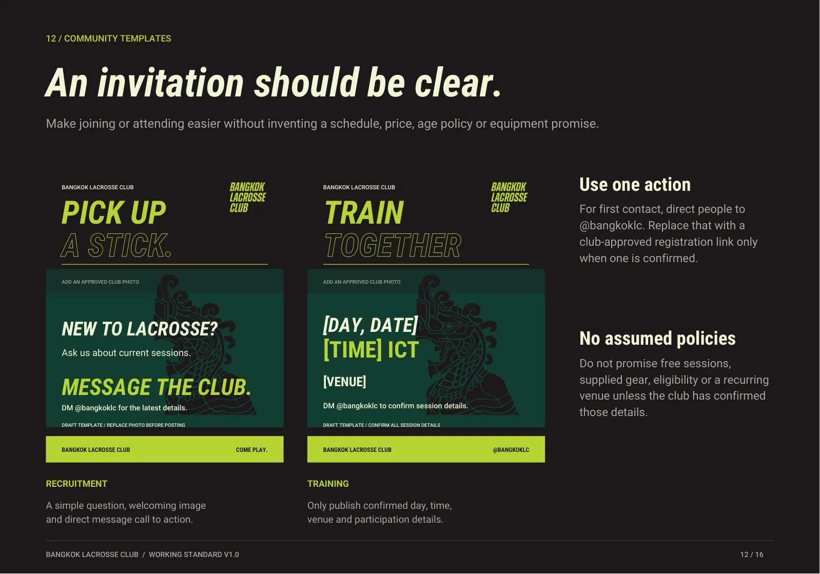 12 Community templates
 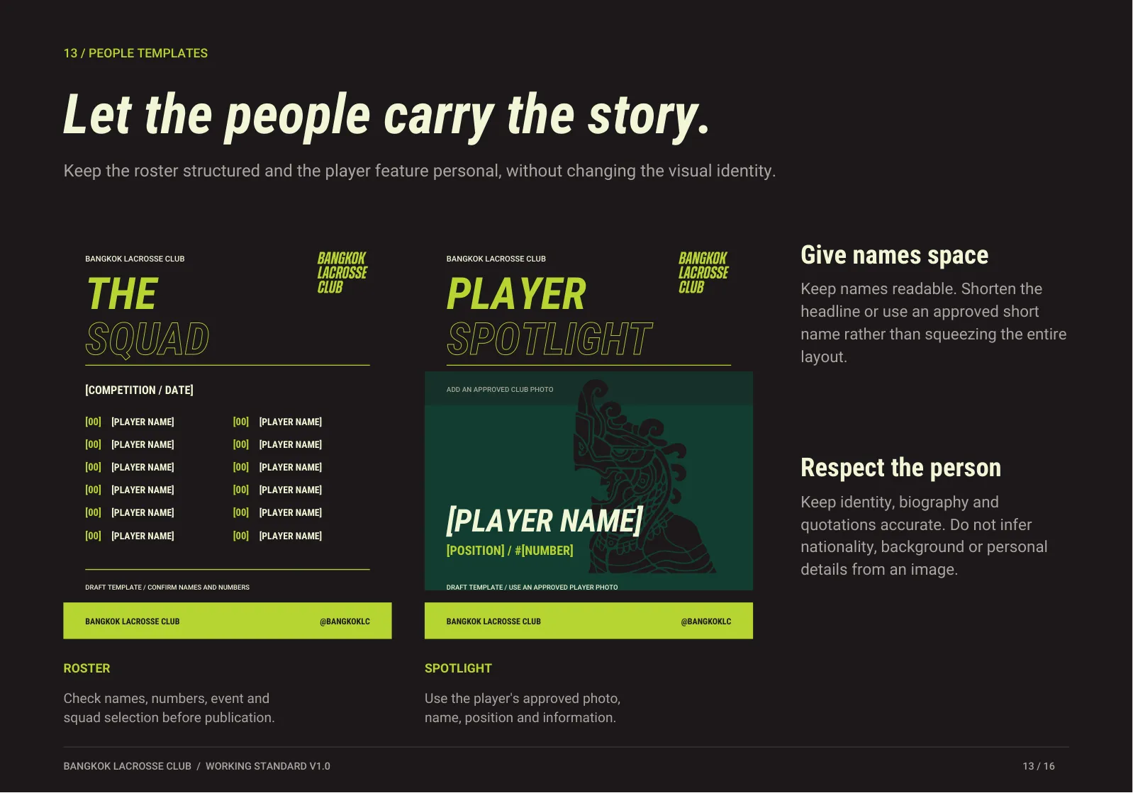 13 People templates
 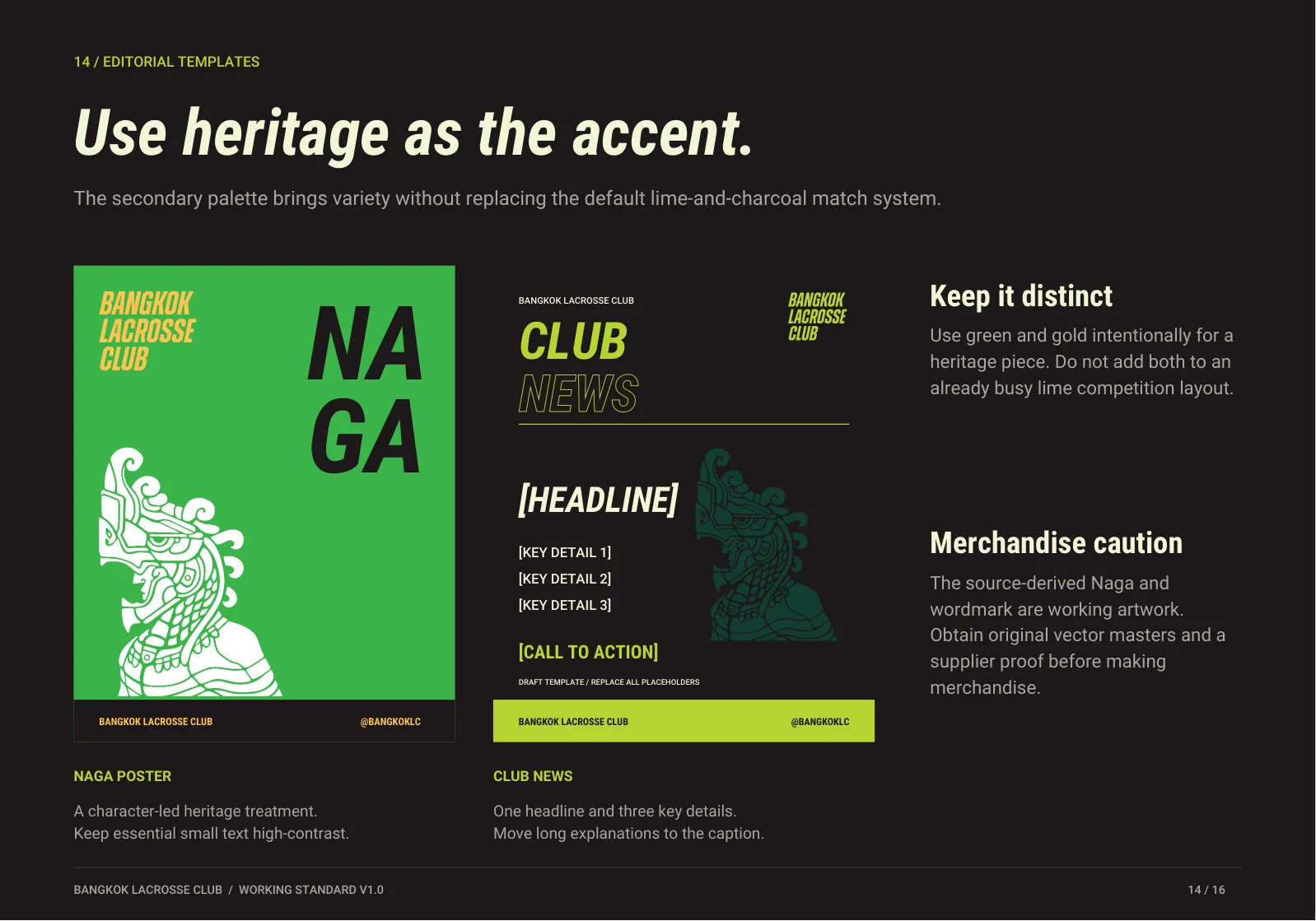 14 Editorial templates
  15 Voice and copy
 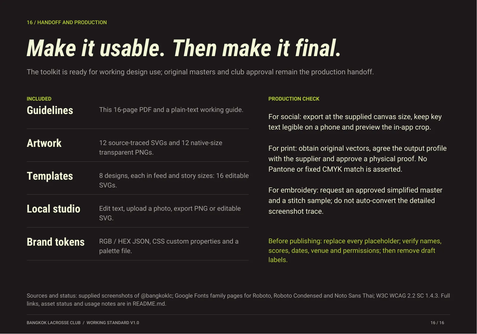 16 Handoff and production
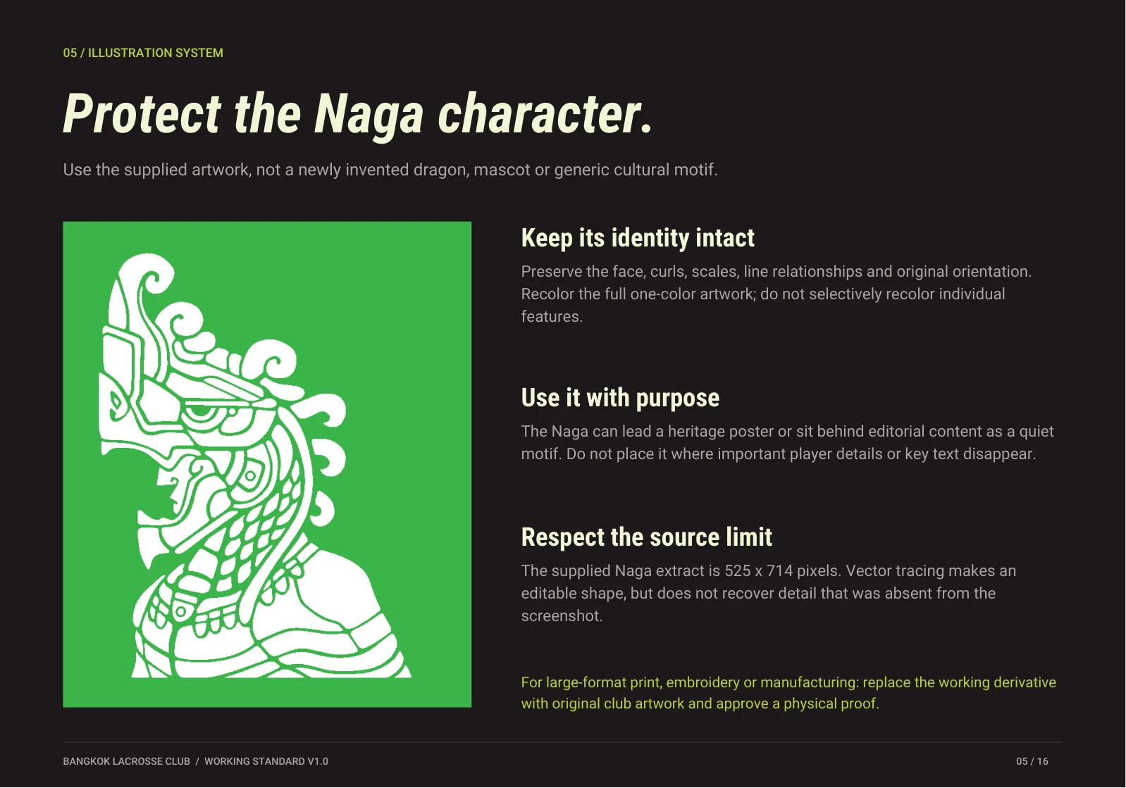
 This is a working toolkit. The wordmark and Naga are traced from screenshots. For print, embroidery or merchandise, get original vector masters from the club and approve a physical proof. No Pantone or fixed CMYK match is claimed. For social posts, replace every placeholder, verify names, scores, dates, venues and permissions, then remove draft labels.
Questions about using the club's name or artwork? Message @bangkoklc.